In May of 2025, the creative teams of Blue Nile and James Allen merged and we took over creating content for both brands. Leadership wanted to develop a new look as part of the holistic strategy taken to improve performance of the James Allen brand. I led the overhaul of existing brand guidelines to create a fresh, modern, and more relevant visual identity for James Allen.
We knew that James Allen needed to be refreshed to feel relevant and appeal to a modern, younger customer. We undertook brand identity and persona development with an external agency while implementing visual updates internally.
I took the existing brand guides and adapted them to feel new, fresh, and current without abandoning existing brand equity. I decided to adopt Montserrat as the brand’s primary typeface, dropping the old serif font. I rebalanced the color palette to use bold black and white as the primary colors and pale pink as a secondary, only using the bright red for pops of color and accents. I developed new email and ad templates that used unexpected spacing and alignment and bolder, sleeker typography.
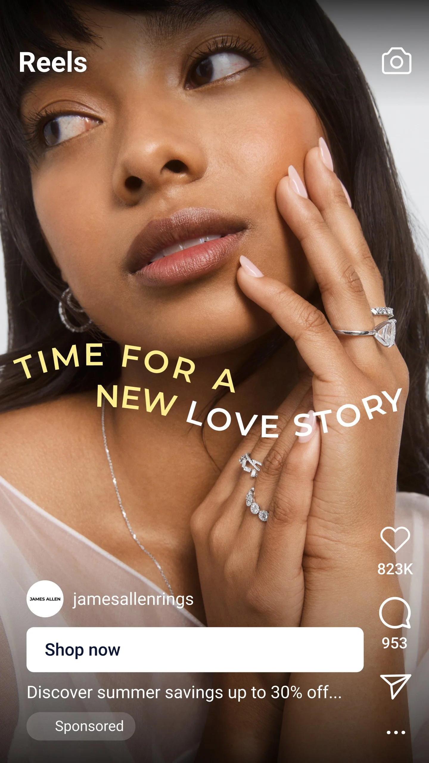
For photography, we shot much closer and utilized unexpected angles and tight crops. Shallow depth of field and softer, directional lighting elevated the imagery.

Old Logo

New Logo
Old Visual Identity


New Visual Identity


Old Email Footer

New Email Footer


One of the first promotions under the new rebrand was the Summer Love Story sale. This was an opportunity to build upon the foundation we had created with our new visuals and expand creatively. I created wavy type for email headers, site pages, and digital ads and used the trending color of the season, butter yellow, to bring seasonal flair to our monochromatic color scheme and imagery.
I created emails, digital banner ads, and paid social assets for this promotion.